Buying Guides
Pink Kitchen Ideas: 9 Shades That Do Not Look Sugary

By the Hill & May team
Updated 2026
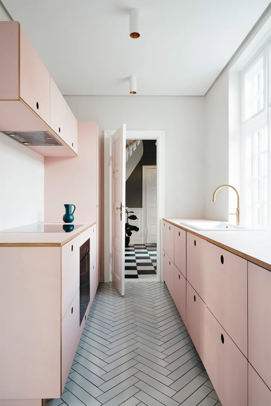
A pink kitchen goes wrong in exactly one way, and it is always the same way: somebody picks a clean, saturated pink, puts it on every door, and ends up with a room that looks like a birthday cake. The pinks that work in a country or traditional kitchen barely register as pink at all. They are plaster, clay, dusty rose and faded brick, colours with enough yellow or brown in them to behave like warm neutrals, and they sit alongside oak, brass and a Belfast sink far more comfortably than grey ever did.
Below are nine ways to use pink in a kitchen that reads as considered rather than novelty, starting with the safest and ending with the full commitment.
1. Start with plaster pink on the walls, not the cabinets
The lowest-risk entry point is a wall colour, because it is the cheapest thing in the room to change your mind about. Farrow & Ball’s Setting Plaster No.231 is the reference shade here, named for the blush of freshly plastered walls and carrying a large dose of yellow pigment, which is why it warms a north-facing room instead of turning it chalky. Pink Ground No.202 is the same idea a shade paler and reads as an off-white with a flush in it.
Against cream or off-white cabinetry, either colour gives you the pink without anyone in the room describing the kitchen as pink. That is usually the goal.
2. Put a dusky rose on the island only
If you want pink on cabinetry, the island is where to spend it. A single painted island against neutral perimeter units is the standard designer move for any strong colour, and it works particularly well with pink because the colour arrives at waist height, surrounded by worktop and floor, rather than looming above you on wall units.
Farrow & Ball’s Sulking Room Pink No.295 is the shade most often used for this: a muted rose with a powdery finish rather than an overtly pink pink. Little Greene’s Hellebore does a similar job with slightly more brown in it. Both hold their character under warm kitchen lighting, which pale pinks often do not. See our kitchen island ideas for how to size and light it.
3. Buy the pink range cooker instead of painting anything
In a range-cooker kitchen the cooker is the focal point already, so putting the colour there gets you a pink kitchen without touching a single door. Rangemaster’s Estel Deluxe 100 Induction is offered in Pale Pink with chrome trim, a soft powder shade that suits a plain cream Shaker kitchen and gives the room its one piece of personality.
AGA does not list pink among its current standard colours, but reconditioned AGAs turn up regularly in pink, blush and raspberry through specialist refurbishers, so a pink AGA is still achievable secondhand. Our AGA range cooker guide and Rangemaster cookers guide cover what the current colour ranges actually include.
4. Two-tone with pink below and off-white above
If you want more than an island, ground the pink at floor level: pink base units, off-white or stone wall units and tall larders. Keeping the deeper tone low and the lighter tone at eye level is the oldest trick in decorating and it stops any colour from closing a room in. It also means the pink is mostly seen against the worktop and the floor, which is where it looks best.
This layout suits in-frame and Shaker doors particularly well, because the shadow lines in the frame give the flat colour something to do. See in-frame vs handleless kitchens and our Shaker kitchen guide.
5. Pair pink with green rather than with white
Pink and cream is safe. Pink and green is better. Sage, olive and muted forest greens sit almost opposite pink on the colour wheel, so the pairing feels rich and grown-up instead of sweet, and both colours are naturally occurring enough that the combination reads as garden rather than nursery.
The usual split is green on the units and pink on the walls, or a green island in a plaster-pink room. Our sage green kitchen ideas and green kitchen ideas cover the greens that partner best.
6. Use terracotta pink if true pink feels like too much
At the browner, redder end of the family sit the clay and terracotta pinks, which give you the warmth with none of the sweetness. They flatter quarry-tiled and terracotta floors that are already common in older kitchens, and they sit closer to the reds covered in our red kitchen ideas than to anything you would call pink.
This is the shade to choose if you are worried about resale or about talking a sceptical household into it. Nobody argues with a clay-coloured kitchen.
7. Keep the metalwork brass or aged nickel, never chrome
Pink and polished chrome fight. The pink turns cold and slightly synthetic, and the chrome looks like a bathroom fitting. Unlacquered brass, antique brass and aged nickel all have enough warmth to belong in the same scheme, and brass in particular picks up the yellow already in a plaster pink. This one detail does more for a pink kitchen than any amount of agonising over the exact shade. Our kitchen door handles guide covers the finishes.
The exception is the Rangemaster pale pink cooker above, which is specified with chrome trim and works because the pink is so pale it never gets warm enough to clash.
8. Try pink on one freestanding piece
You do not have to touch the fitted kitchen at all. A painted dresser, a larder cupboard, a kitchen table or a run of open shelving in a dusky pink gives you the colour as something you can repaint in a weekend. Little Greene’s pink and red palette includes Dorchester Pink No.213, a genuine 1960s archive colour, and its paler tonal partner Dorchester Pink Pale, both of which suit an old piece of furniture without looking freshly bought.
This is the right approach if you rent, or if the kitchen is due to be replaced within a few years. See freestanding kitchen units.
9. Commit properly, but only in a room with light
The full pink kitchen, every door painted, is the version that either looks superb or looks like a mistake, and the deciding factor is light. In a bright room with a decent window, a colour-drenched plaster pink across the units, walls and even the ceiling reads as soft and enveloping. In a dark galley with one small window it goes muddy and slightly grey.
If you are going all in, test large sample boards on more than one wall and look at them after dark under your actual bulbs, not just in daylight. Pinks shift more between daylight and lamplight than almost any other family of colours, which is exactly why so many people report that the paint “looked different in the shop”. Our kitchen cupboard paint guide covers preparation and finishes for painting existing doors, and kitchen colour ideas sets pink alongside the alternatives.
What to put with it
- Worktops: oak, beech or a warm-toned stone. Cool grey quartz kills a pink scheme faster than anything else.
- Floors: terracotta, quarry tile, flagstone or a warm oak board.
- Splashback: plain white metro, zellige with visible variation, or a run of the same paint colour behind glass.
- Sink: a fireclay Belfast in white, which cools the scheme just enough. See our Belfast sink buying guide.
- Avoid: high-gloss doors, cool white LED lighting, and any pink with blue in it on more than a small surface.
Frequently asked questions
Will a pink kitchen date? The muted plaster, clay and dusky rose shades date very slowly, because they behave as warm neutrals rather than fashion colours and have been used in English interiors for well over a century. Clean, saturated pinks date quickly, so keep those to small, easily replaced items such as a chair, a bowl or the inside of a glazed dresser.
What colours go with a pink kitchen? Cream and off-white are the easy partners. Muted greens, sage through to olive, give a richer and more grown-up result. Warm wood, terracotta and brass all belong. The combinations to avoid are cool grey, polished chrome and bright white, all of which make pink look colder and more artificial than it is.
Can you buy a pink range cooker in the UK? Yes. Rangemaster lists Pale Pink as a colour on the Estel Deluxe 100 Induction, with chrome trim. AGA does not currently offer pink as a standard new colour, but reconditioned AGAs in pink, blush and raspberry are regularly available from specialist refurbishers.
Is pink a good colour for a small kitchen? A pale plaster pink is a good choice for a small kitchen, because it is essentially an off-white with warmth and it will not shrink the room. Deep dusky pinks on every door will make a small, poorly lit kitchen feel closed in, so use those on the island or the base units only and keep everything at eye level light.
What is the best pink paint for kitchen cabinets? Setting Plaster and Pink Ground from Farrow & Ball are the standard pale choices; Sulking Room Pink and Little Greene’s Hellebore are the standard dusky ones for cabinetry. Whichever you choose, buy it in a hard-wearing eggshell or a dedicated cabinet finish rather than a wall emulsion, and test it after dark before ordering.
Does pink work in a north-facing kitchen? It can, but only the pinks with yellow in them. North light is cool and blue, so a pink with any blue in its base will look grey and slightly dirty all day. Setting Plaster and the clay and terracotta pinks hold up because their yellow and brown pigments push back against the cool light.