Buying Guides
Cream Kitchen Ideas: Warm, Classic and Timeless Inspiration

By the Hill & May team
Updated 2026
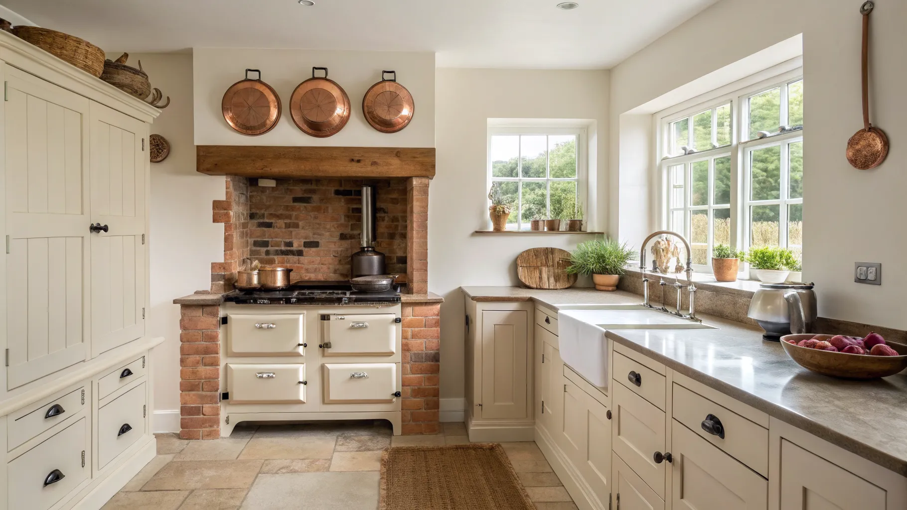
A cream kitchen is the quiet workhorse of British kitchen design. It carries the softness of a traditional country look without the coldness of brilliant white, and it flatters exactly the materials a country kitchen is built from: solid oak, painted timber, natural stone and a cast-iron range. After a decade of stark white kitchens, warm creamy neutrals are firmly back, and they suit an older or rural home far better than a gallery-white finish ever did.
Below are the cream kitchen ideas worth stealing, from the right shade of cream to the worktops, floors and hardware that make it sing, plus how to style cream around a range cooker so the whole room hangs together.
Why cream works when white can feel cold
White reflects light flatly and can look clinical under grey British daylight. Cream holds a trace of yellow or a hint of greige, so it reads as warm and lived-in rather than sterile. That warmth is the whole point of the current “quiet luxury” mood in kitchen design: matt, textured finishes and warm neutrals that feel inviting rather than showroom-crisp. In a cottage or farmhouse, cream also sits happily against uneven walls, beams and flagstones, where a hard white would only highlight every imperfection.
Choose your shade of cream
Cream is not one colour. Getting the undertone right is the single most important decision:
- Classic cream with a soft yellow base is the traditional country choice, warm and forgiving in low light.
- Cashmere, a greige-leaning cream, is the shade of the moment. It is a touch cooler and more contemporary, and it pairs beautifully with brushed brass and pale timber.
- Almond and clotted-cream tones sit between the two, deep enough to feel substantial on a large run of cabinets.
Always test your shortlisted shades on a board and look at them in both morning and evening light before you commit. A cream that looks perfect in the showroom can turn faintly green or pink in your own kitchen depending on which way the room faces.
Cabinet styles that suit cream
Cream is most at home on a Shaker door, where the recessed panel and simple frame read as timeless. If you want something a little more current, a microshaker, with its narrower frame, keeps the traditional feel while looking crisper. For an even more classic country result, an in-frame cabinet in cream gives you that handmade, furniture-like depth. Our Shaker kitchen guide walks through the door styles in more detail if you are weighing them up.
Two-tone is a smart way to use cream without it feeling flat: cream on the wall units and a deeper colour, a sage green, a muted navy or a soft clay, on the island or the base run. It grounds the room and stops a large cream kitchen looking washed out.
Worktops, floors and the fifth wall
The materials around the cabinets are what lift cream from bland to refined:
- Worktops: timber and butcher’s block bring farmhouse warmth; honed quartz or a limestone-look surface keeps things calm and practical. Warm-veined marble or a marble-effect quartz reads as understated luxury against cream.
- Floors: natural stone flags, terracotta and warm-toned oak all reinforce the country feel. Cool grey porcelain can fight the warmth of cream, so lean warm.
- Walls and splashbacks: textured zellige tiles, a warm plaster finish or a simple painted wall in a slightly deeper stone shade add depth without pulling focus.
Hardware and finishing touches
Hardware is where a cream kitchen earns its character. Brushed brass and aged bronze are the natural partners, adding a glow that stainless steel cannot. Cup handles and knurled knobs suit the traditional look; slim bar handles nudge it more modern. Mixing a cup handle on drawers with a knob on doors is a classic country combination that reads as considered rather than uniform.
Open shelving in oak, a butler sink, and a mix of ceramics and copperware on display all reinforce the warm, collected country feel that cream sets up so well.
Styling cream around a range cooker
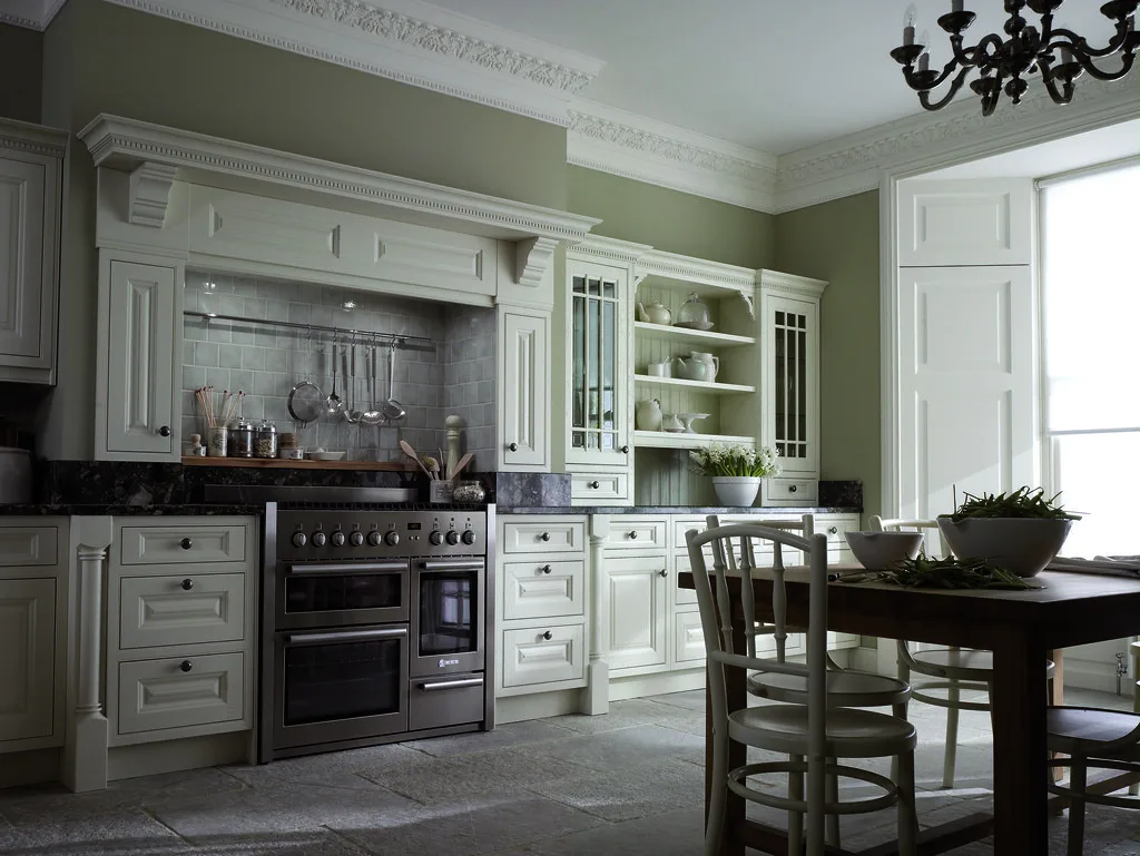
For a country kitchen built around a range, cream is close to the perfect backdrop. A cream painted run lets a statement cooker take centre stage, whether that is the glossy enamel of an Aga in a heritage colour or the stainless and black of a modern range cooker. Cream cabinets in a heritage tone flanking a coloured Aga is one of the most enduring British kitchen looks there is.
If your range is stainless, warm brass hardware ties the metals together so the steel does not read as cold against the cream. If it is a cream or ivory enamel cooker, keep the cabinet shade a shade or two different so the two creams do not clash; matching them exactly rarely works.
A few pairings that always land
- Cream Shaker cabinets, oak worktops, brass cup handles, stone floor: the classic farmhouse.
- Cashmere cabinets, marble-effect quartz, brushed brass, pale oak floor: quiet-luxury country.
- Cream wall units over a sage-green island, timber tops, a butler sink: two-tone with a modern edge.
For more colour direction across the whole room, see our kitchen colour ideas, and if you love warm timber, the oak and wood kitchen ideas pair naturally with a cream scheme. For a broader palette guide, Which? kitchen trends is a useful neutral reference.
Frequently asked questions
Is a cream kitchen still in style? Yes. Warm creamy neutrals and cashmere tones are firmly back in favour, replacing the stark white kitchens of the past decade. They suit the current “quiet luxury” mood and are especially well matched to country and period homes.
What colour worktop goes with cream kitchen units? Timber and butcher’s block for a farmhouse feel, or honed quartz, limestone-look and warm marble-effect surfaces for a calmer, more refined look. Lean towards warm tones; cool grey worktops can fight the warmth of cream.
What is the difference between cream and cashmere kitchens? Classic cream has a soft yellow undertone and reads as traditional and warm. Cashmere is a greige-leaning cream, slightly cooler and more contemporary, and it pairs particularly well with brushed brass and pale wood.
Do cream kitchens show dirt more than white? Not really. Cream is more forgiving than brilliant white because its warmth hides marks and shadows better, and a matt or satin painted finish wipes clean easily. As with any painted kitchen, choosing a durable, washable finish matters more than the colour.
What handles suit a cream kitchen? Brushed brass and aged bronze are the natural choices, adding warmth that stainless steel lacks. Cup handles and knurled knobs suit a traditional cream Shaker kitchen, while slim bar handles give a more modern result.